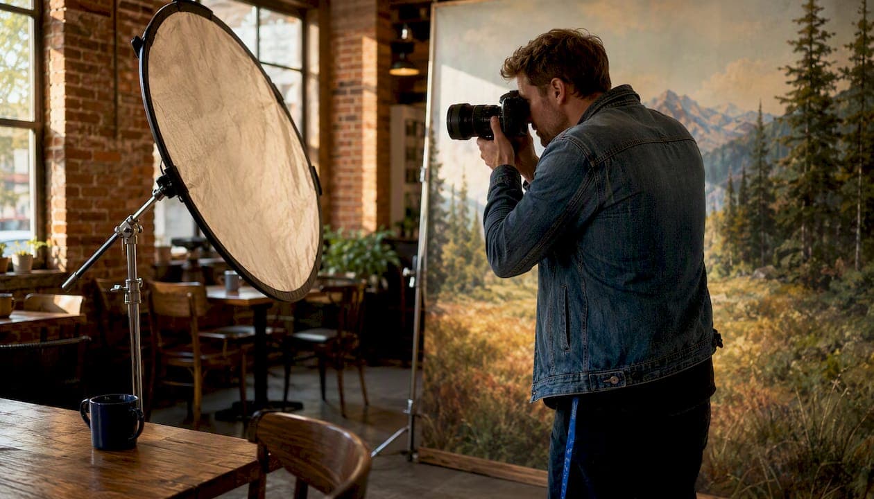
Image backdrops set a photograph's visual context and change how viewers read the subject before they consciously register a face or product. The background is not neutral scenery. It actively modifies meaning, color balance, and perceived depth in every frame.
TL;DR:
- Backdrops shape narrative through a halo transfer effect: environmental cues transfer trait impressions to the subject within milliseconds, before the viewer evaluates anything else.
- They alter exposure and color balance physically, through reflectance and color spill, not just aesthetically.
- Quick win you can test right now: move your subject 6–8 feet from a white paper roll. That single change reduces background spill, restores shoulder separation, and cuts retouching time.
Pro Tip: Before any shoot, fire one test frame with only the backdrop lit. If the background reads the tone and color you want with no subject in frame, your lighting foundation is solid.
Table of Contents
- Why image backdrops matter for composition and storytelling
- How material, color, and reflectance change your exposure and color balance
- How distance, aperture, and focal length control subject-background separation
- Which backdrops work best for portraits, products, newborns, fashion, and weddings
- Common backdrop mistakes and how to fix them fast
- How to pick and set up a backdrop: a practical checklist
- How backdrop choice changed a wedding portrait session: a Larsonprophotography case note
- Key Takeaways
- The backdrop is the decision most photographers make last and should make first
- Larsonprophotography brings backdrop craft to every San Antonio session
- Useful sources for further reading
Why image backdrops matter for composition and storytelling
The background is part of the visual sentence. It modifies the subject the way an adjective modifies a noun. A person photographed against a clean mid-tone gray reads as composed, professional, and self-contained. The same person in front of a weathered brick wall reads as creative, grounded, or urban. The subject did not change. The story did.
This happens because of what researchers call halo transfer: environmental traits migrate to the subject in the viewer's mind almost instantly. A cluttered background implies a cluttered person. A warm, textured backdrop suggests warmth and depth. Photographers who match background tone to industry norms increase perceived professionalism and viewer engagement, because the background confirms what the audience already expects to see.
That principle separates a snapshot from a portrait. In a clean studio portrait, the background recedes and the subject carries all the narrative weight. In an environmental portrait, the background shares that weight: a chef photographed in a working kitchen, flour on the counter, copper pots in soft focus behind her, tells a story no seamless paper roll can replicate. The choice between those two approaches is a storytelling decision, not a technical one.
Practically, a few composition rules govern how backgrounds support subjects:
- Leading lines: Background lines (a fence, a corridor, a horizon) should guide the eye toward the subject, not away from it. Position the subject where those lines converge.
- Negative space: A background with open, uncluttered space on one side creates breathing room and implies movement or thought.
- Horizon placement: Keep the horizon line off the subject's neck. A horizon cutting across the throat is one of the most common and most distracting background errors in portrait work.
- Layered texture: Textured or layered backgrounds add three-dimensionality that flat single-tone surfaces cannot, especially in large-format print where a viewer spends real time looking.
Understanding storytelling through environment is what separates technically correct images from ones people remember.
How material, color, and reflectance change your exposure and color balance
The physical properties of a backdrop are not passive. They interact with your light sources and change what the camera records.
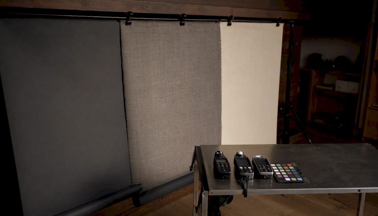
Reflectance and absorbance are the two poles. White seamless paper acts as a giant bounce card: it picks up your key light and throws fill back onto the subject's shadow side. That can be useful for beauty work where you want soft, even skin. It becomes a problem when you need contrast or when the fill is uncontrolled and flattens the subject's features. Black paper absorbs light rather than reflecting it, producing deep cinematic contrast without extra rigging. Mid-tone gray sits between those extremes and is the most forgiving starting point for most portrait work.
Color spill is subtler and more damaging than most photographers expect. A saturated red or green backdrop will cast a color tint onto the subject's skin, hair, and clothing. The camera's auto white balance will try to compensate and usually make things worse. The fix is to light the background separately, flag the spill with black foam core, and set a custom white balance from a gray card placed at the subject position. Different gray rolls also read differently under flash: a slightly warm gray can make pale skin glow, while a cooler gray often renders deeper skin tones with more richness and clarity.
Common materials and their behaviors:
| Material | Reflectance | Portability | Best use |
|---|---|---|---|
| Seamless paper | Medium–high (white); low (black/dark) | Good (86" rolls travel well) | Headshots, product, consistent studio work |
| Muslin | Low–medium, wrinkle-prone | Moderate | Lifestyle portraits, vintage looks |
| Vinyl/PVC | Low, non-reflective matte | Moderate | Food, product, flat lay |
| Textured fabric | Variable | Moderate | Fashion, editorial, large-format print |
Seamless paper is the workhorse for a reason: it is affordable, recyclable, and consistent shot to shot. When a section gets stained or scuffed, you trim it and reveal fresh paper underneath.
Quick corrective workflow on set:
- Set subject-to-background distance before adjusting any light.
- Meter the background separately from the subject. For a white background to read pure white, expose it one stop above the subject. For gray, match the subject exposure.
- Place flags (black foam core panels) between the background light and the subject to prevent spill.
- Shoot a custom white balance from a gray card at the subject position, not at the camera.
Pro Tip: Store paper rolls vertically, not horizontally. Horizontal storage creates flat spots and creases that catch light unevenly and show up in the final image.
How distance, aperture, and focal length control subject-background separation
The single most effective thing you can do to improve background separation is increase the distance between your subject and the backdrop. Move the subject forward, not the background back. Studios commonly position subjects 6–8 feet from a white background to control reflected fill and maintain clean shoulder and hair separation.
Distance alone is not enough. Aperture and focal length determine how much the background blurs once that distance exists.
How the variables interact:
- A wider aperture (f/1.8, f/2.8) produces a shallower depth of field and more background blur at any given distance.
- A longer focal length (85mm, 105mm, 135mm) compresses the background and magnifies the blur effect, even at the same aperture.
- A larger sensor captures more background blur than a crop sensor at identical settings.
Rule-of-thumb combinations for common setups:
- Headshot: 85mm, f/2.8, subject 6 feet from background. Background reads as smooth, out-of-focus tone with no distracting detail.
- Three-quarter portrait: 70–85mm, f/4, subject 8 feet from background. Enough depth of field to keep the full figure sharp while the background softens.
- Product tabletop: 50–100mm macro, f/8–f/11, subject 2–3 feet from a matte vinyl surface. Background stays sharp and even; texture reads cleanly.
Before/after scenario: Imagine a headshot where the subject stands 18 inches from a white wall, shot at f/5.6 on a 50mm lens. The wall is sharp, the subject's shoulders merge with it visually, and the white reflects fill onto the shadow side of the face. Move the subject 6 feet forward, switch to an 85mm at f/2.8, and the wall dissolves into a smooth, neutral tone. The face gains dimension. The shoulders separate cleanly. Nothing else changed.
For platform-specific work, high-contrast clean backgrounds perform best in thumbnail and heavily compressed digital formats, where fine background detail disappears anyway and subject visibility is the only thing that matters.
Which backdrops work best for portraits, products, newborns, fashion, and weddings
Genre shapes the backdrop decision more than personal preference does. Each type of photography has a primary background job.
Portraits and headshots: The background's job is to support the subject without competing. Mid-tone gray or warm off-white seamless paper, subject 6–8 feet back, f/2.8 or wider. Avoid matching clothing tones to the background; a dark jacket against a dark gray backdrop loses shoulder definition entirely.

Product and e-commerce: Clean, consistent, and repeatable. White or light gray vinyl for catalog shots; contextual lifestyle surfaces (wood, marble, slate) for experience-product imagery. Contextual backgrounds increase mental imagery and product liking for experience goods, while plain white works better for search products where specs matter more than mood.
Newborn photography: Soft, low-contrast textures. Wrinkled muslin, layered blankets, or muted fabric wraps. Avoid high-contrast or saturated backgrounds; newborn skin tones are delicate and color spill reads immediately. Keep the background warm and the light soft and directional.
Fashion and editorial: This is where textured and layered backdrops earn their keep. A fabric fold, a painted canvas, or a concrete wall adds the three-dimensionality that makes fashion images feel tactile. Match background complexity to the garment: a busy print needs a clean background; a minimal garment can carry a richer backdrop.
Weddings: The environment is usually the backdrop, and the photographer's job is to find or create separation within it. For formal portraits, a clean architectural element or a soft-focus garden works as a natural seamless. For detail shots (rings, florals, invitations), a matte fabric or wood surface keeps the focus on texture and color. Backdrop ideas for wedding portraits that actually work tend to use the venue's existing architecture rather than fighting it.
Social thumbnails and LinkedIn profiles: High contrast, clean, and simple. A plain mid-tone background with strong subject-to-background separation reads clearly at 100 pixels wide. Textured backgrounds designed for large-format print look muddy at thumbnail size.
| Backdrop type | Visual impact | Portability | Maintenance |
|---|---|---|---|
| Seamless paper | High (consistent) | Good | Low (trim and replace) |
| Painted muslin | Medium–high | Moderate | Medium (steaming required) |
| Vinyl/PVC | Medium | Moderate | Low (wipe clean) |
| Textured fabric/canvas | High (editorial) | Low–moderate | Medium |
| Environmental/location | Highest (narrative) | None needed | None (use what's there) |
Common backdrop mistakes and how to fix them fast
Most backdrop problems are visible in the first test frame if you know what to look for.
Wrinkles and creases are the most common issue with muslin and fabric backdrops. They catch light directionally and create distracting shadows. Fix: steam the backdrop before the shoot, not during. A handheld garment steamer takes five minutes and eliminates the problem entirely. Paper rolls do not wrinkle, but they crease if stored horizontally or rolled too tightly.
Color clash between wardrobe and background happens when a subject wears a color close to the backdrop tone. The subject's edges dissolve into the background and separation disappears. Fix: ask clients to avoid wearing colors within two stops of the background tone. A quick wardrobe check before the first frame costs nothing.
Unintended reflections from vinyl or glossy surfaces show up as hot spots on the background, especially with off-axis lighting. Fix: move the light source to a more oblique angle, or switch to a matte vinyl surface.
Incorrect background exposure is the most technically damaging mistake. A white background exposed at the same level as the subject reads as light gray, not white. A gray background overexposed by two stops reads as white and blows out. Meter the background separately and set it intentionally.
Cheap collapsible pop-up backgrounds are fine for video calls, social content, and quick product shots where the background is secondary. They are not suitable for client portrait work: the fabric wrinkles at the edges, the support system is visible in wide shots, and the colors are rarely neutral enough to avoid spill. Use them when convenience matters more than quality; avoid them when the background is part of the deliverable.
30-second on-set diagnostic:
- Does the background tone match what you metered for?
- Is there visible color spill on the subject's skin or clothing?
- Are there wrinkles, creases, or seams visible in the frame?
- Does the subject's wardrobe separate cleanly from the background?
- Are leading lines in the background pointing toward the subject?
Pro Tip: Run this checklist on your first test frame, not your last. Fixing a backdrop problem after 200 frames means retouching 200 frames.
How to pick and set up a backdrop: a practical checklist
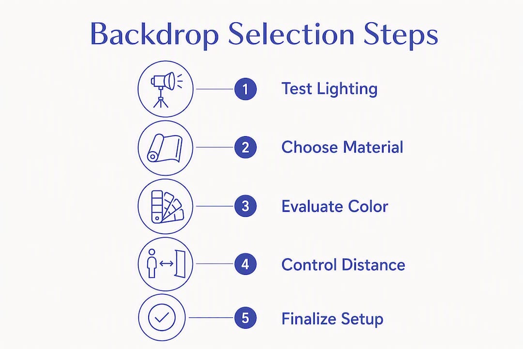
Pick the backdrop that matches the story and the reproduction medium, then set distance and lighting to control separation. Everything else is adjustment.
- Define the end use. A LinkedIn headshot, a magazine spread, and an e-commerce catalog have different compression, size, and contrast requirements. High-contrast clean backgrounds for digital thumbnails; textured surfaces for large-format print.
- Choose material and tone. Paper for consistency and speed. Fabric for texture and warmth. Vinyl for product work. Match tone to the subject's skin and wardrobe, not to personal preference.
- Set subject-to-background distance. Minimum 6 feet for white backgrounds. Closer is acceptable for dark or mid-tone backgrounds where spill is less of an issue.
- Light the background separately. Use a dedicated background light or let ambient light fall on it naturally. Never assume the key light will handle both subject and background correctly.
- Test and adjust white balance. Place a gray card at the subject position, shoot a custom white balance frame, and apply it before the session starts.
- Final polish. Steam or trim the backdrop, check for visible seams or hardware, and remove anything in the frame that does not serve the image.
The 20-60-20 rule applied to backgrounds: roughly 20% of the frame should be the subject's immediate environment (clothing, hands, props), 60% should be the primary background tone, and 20% can carry texture, depth, or contextual detail. When the background takes more than 40% of the visual weight, it competes with the subject. When it takes less than 10%, the image can feel flat and context-free.
For traveling photographers, 86-inch paper rolls cover most framing needs from headshots to three-quarter portraits and fit in a standard backdrop stand bag. Own at least one white, one mid-tone gray, and one dark neutral. That three-roll kit handles 90% of studio portrait scenarios.
Pro Tip: Run an A/B test on a single subject: shoot one frame against your chosen background, then swap to a different tone or texture and shoot again. Isolating the background as a variable shows its real contribution to the image faster than any amount of theory.
How backdrop choice changed a wedding portrait session: a Larsonprophotography case note
At a recent San Antonio wedding, the original plan called for formal portraits against the venue's white interior wall. The wall was clean and well-lit, but it read as flat and institutional in test frames, with no separation between the bride's white gown and the background.
The decision was to move the couple outside to a shaded garden wall with soft, warm stone texture. The background shifted from a flat white plane to a layered, three-dimensional surface that complemented the warm tones of the afternoon light. The gown separated cleanly. The stone texture added depth without competing for attention.
The practical results:
- Retouching time dropped because the background required no masking or replacement.
- The gallery had a consistent warm tone across all formal portraits, which made album design straightforward.
- The contextual background added narrative: the couple looked like they belonged in that place, not in front of a wall.
Todd, the photographer behind Larsonprophotography, approaches every session with a background test frame before the couple steps in. The test frame reveals how the background reads under the actual light conditions of that location, not how it looked during setup. That single habit catches exposure mismatches, color spill, and compositional problems before they appear in 300 frames.
For couples planning a wedding in San Antonio, understanding visual narrative in wedding shoots starts with the background decision, not the pose.
Key Takeaways
The backdrop is a compositional and technical tool that shapes every element of a photograph, from first impression to final retouch.
| Point | Details |
|---|---|
| Backdrops set context instantly | Halo transfer means environmental cues shape viewer impressions before the subject is consciously evaluated. |
| Distance controls separation | Positioning subjects 6–8 feet from a white background reduces spill and restores clean shoulder definition. |
| Material determines light behavior | White paper bounces fill light back onto the subject; black paper absorbs it for cinematic contrast. |
| Match backdrop to distribution | High-contrast clean backgrounds work for thumbnails; textured surfaces suit large-format print. |
| Larsonprophotography applies these principles | Todd's San Antonio wedding sessions use background test frames and location-specific backdrop choices to reduce retouching and build gallery consistency. |
The backdrop is the decision most photographers make last and should make first
The conventional wisdom is that backdrops are a support element, something you set up and then stop thinking about. That framing is backwards. The background decision shapes every other decision in the frame: where to place the light, what aperture to use, how to direct the subject's wardrobe. Getting to set and choosing a backdrop based on what happens to be rolled up in the corner is the single most common reason technically well-exposed portraits feel generic.
What photographers underestimate is how much the background communicates to viewers who have no photography knowledge at all. A viewer looking at a headshot does not think "that's a mid-tone gray seamless paper roll." They think "this person is serious" or "this person is approachable" or "this person looks like they belong in that environment." The background did that work silently, in the first fraction of a second.
The practical implication: treat the backdrop selection as a creative brief, not a logistics task. Ask what the image needs to communicate before you unroll anything. A five-minute conversation about end use, platform, and subject tone will produce a better backdrop decision than any amount of gear.
Larsonprophotography brings backdrop craft to every San Antonio session
Knowing why backdrops matter is one thing. Having a photographer who builds that knowledge into every session is another.
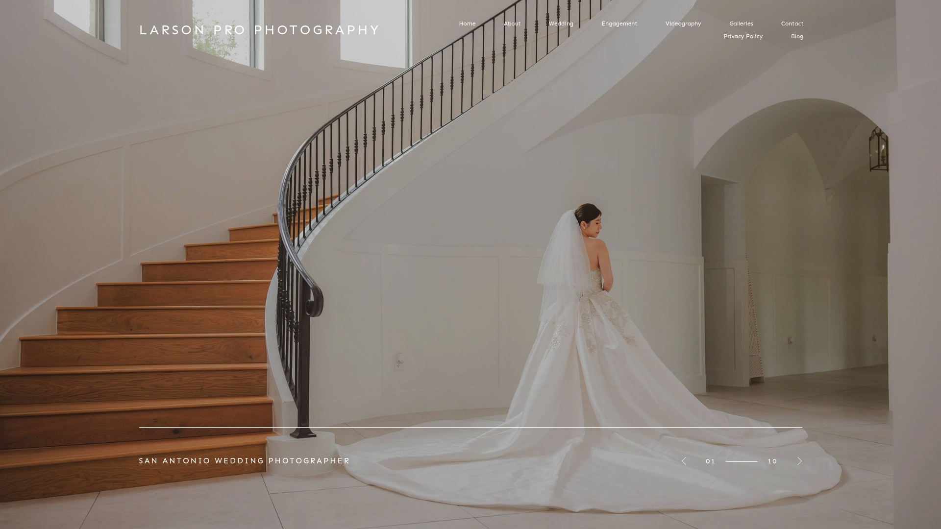
Larsonprophotography specializes in wedding, engagement, and portrait photography in San Antonio, and backdrop selection is part of the creative process from the first planning conversation. Every session includes a location or studio background assessment, a test frame before the couple steps in, and lighting adjusted specifically for the chosen background. The result is a gallery with consistent tone, clean separation, and images that hold up at every size, from phone screens to full-bleed prints.
If you want to see how these choices look in practice, the client portfolio shows recent wedding and engagement work. Ready to talk about your session? The engagement page has package details and a direct path to booking.
Useful sources for further reading
These sources informed this article and are worth bookmarking for deeper study. Read them, then go test the principles on set.
- Best Ever Backdrops: What Are Photography Backdrops? — A clear breakdown of backdrop types, materials, and use cases across genres including food, product, and portrait work.
- Photography Shark Studios: Professional Headshot Backgrounds — Detailed guidance on color temperature, gray tone selection, and platform-specific background choices for headshots.
- Superior Seamless Paper: Benefits of Paper Backdrops — Technical breakdown of seamless paper's reflectance properties, portability specs, and maintenance workflow.
- Depositphotos: Photography Background Explainer — Covers how blurred foregrounds and contextual backgrounds work together to anchor storytelling in a frame.
- That Toronto Studio: Why Backdrops Matter More Than You Think — Studio-focused perspective on layered textures, three-dimensionality, and when to move beyond flat single-tone surfaces.
- Starkie AI: How Background Shapes First Impressions — Psychology-grounded explanation of halo transfer and how background calibration affects perceived professionalism and engagement.