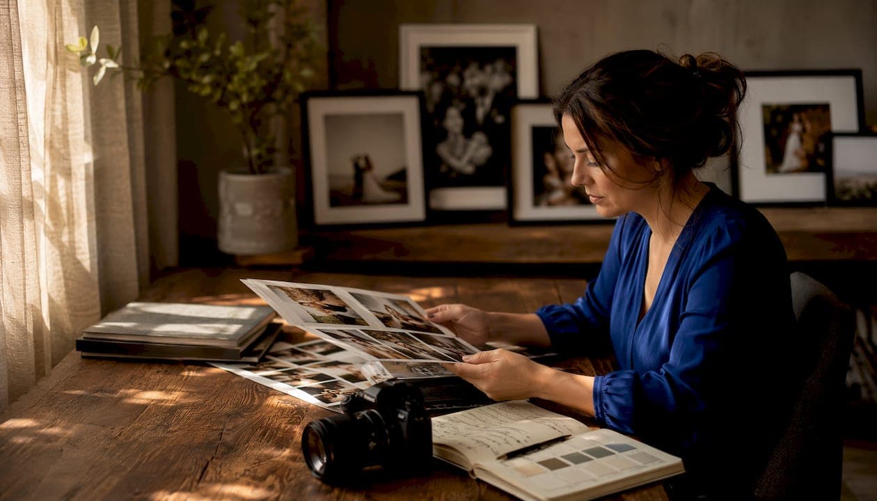
A wedding gallery tells a story. When that story reads as one coherent experience, from the quiet morning prep shots to the last dance, couples feel it. When it doesn't, they feel that too, even if they can't name why. Consistency in wedding photography is what separates a gallery that moves people from a collection of technically decent images that never quite add up.
Here's the short version of why it matters:
- Emotional flow: Steady tonal relationships and skin-tone constancy let feelings land without visual interruption.
- Readability: Fluctuating exposure and color temperature create visual friction that weakens the viewer's emotional response.
- Long-term value: A cohesive gallery supports album design, print orders, and the memories you'll return to for decades.
Pro Tip: Before you book any photographer, ask to see a complete full-day gallery from a recent wedding, not just their Instagram highlights. That's where you see whether quality holds across every lighting condition and chapter of the day.
Table of Contents
- What does "consistency" actually mean in a wedding gallery?
- Which technical levers actually control visual consistency?
- How does sequencing shape the emotional story in a gallery?
- How does your wedding-day timeline affect gallery consistency?
- What editing workflow actually produces consistent galleries?
- Questions to ask your photographer about consistency
- How does consistency affect editing time and what you pay?
- How Larsonprophotography approaches consistent gallery delivery
- Key Takeaways
- A photographer's honest take on what consistency really costs
- Larsonprophotography: story-driven galleries built for couples in San Antonio
- Useful sources for further reading
What does "consistency" actually mean in a wedding gallery?
Consistency is not every photo looking identical. That's uniformity, and it's neither achievable nor desirable across a 10-hour wedding day. Real consistency is visual harmony: stable tonal relationships, predictable color rendering, and a sequencing logic that shapes how you feel as you move through the gallery.
Think of it this way. A morning prep image shot in soft window light and an evening dance shot under tungsten reception lighting will look different. They should. But when skin tones stay warm and natural, when the contrast curve doesn't swing wildly between chapters, and when the editing hand feels recognizably the same, those two images still feel like they belong to the same story.
Consistency is the visual DNA that runs through every image in a gallery. It's not about sameness. It's about giving the viewer a thread they can follow from the first frame to the last, so the story lands as a whole rather than a series of disconnected moments.
For couples, this has direct practical consequences. Consistent galleries produce better albums because the images sequence naturally. They deliver fewer surprises when the final gallery arrives. And they hold up over time, because the editing choices weren't chasing a trend or compensating for technical errors.
Which technical levers actually control visual consistency?
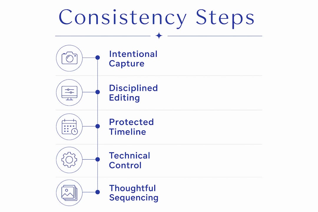
Consistency begins at capture, not in Lightroom. That's the principle the Institute of Photographers' professional framework emphasizes: deliberate camera settings and exposure discipline reduce the need for heavy manual fixes that can degrade image quality and break uniform editing pipelines.
The key technical levers:
- White balance: Set manually or locked to a specific Kelvin value per lighting environment. Auto white balance drifts between frames and creates mismatched skin tones that no preset can fix uniformly.
- Exposure: Use histogram discipline and expose for highlights. Underexposed files pushed in post introduce noise and color shifts that compound across a gallery.
- Tonal control: Consistent highlight recovery, shadow lift, and black point across images in the same chapter keep the contrast curve recognizable.
- Color grading: Skin-tone constancy is the most visible consistency signal. Viewers notice when faces shift from warm to cool between images.
- Aspect ratio and crop: Varying crop styles within a gallery create visual restlessness. A consistent crop philosophy (whether that's 3:2 or a mix of portrait/landscape ratios applied deliberately) keeps the eye comfortable.
- ISO and noise handling: Matching noise reduction across high-ISO reception shots prevents some images from looking soft while others look sharp.
Pro Tip: The anchor-image method is one of the most practical tools a photographer can use. Pick one well-exposed, well-composed image from each lighting chapter, edit it to your target look, then use it as the reference for batch corrections across that group. It's faster and more reliable than editing each image from scratch.
The reason presets alone won't guarantee consistency is simple: presets require consistent input data. If exposures fluctuate by two stops between frames, a single preset applied across all of them produces mismatched results. A tungsten reception and a golden-hour portrait session need separate preset variations, each adjusted to the anchor image for that chapter.
| Technical Element | Consistency Risk if Ignored | Practical Fix |
|---|---|---|
| White balance | Mismatched skin tones across chapters | Manual Kelvin per environment |
| Exposure | Noise and color shifts in pushed files | Histogram discipline, expose for highlights |
| Color grading | Inconsistent warmth/coolness across faces | Skin-tone pass after batch edit |
| Crop/aspect ratio | Visual restlessness in album layout | Consistent crop philosophy per chapter |
| Noise handling | Soft vs. sharp images in same gallery | Matched noise reduction by ISO range |
How does sequencing shape the emotional story in a gallery?
Technical consistency gets you to the starting line. Sequencing is what actually makes a gallery feel like a story. Curation choices determine whether images read as a cohesive narrative or a chronological dump, and the difference is felt immediately.
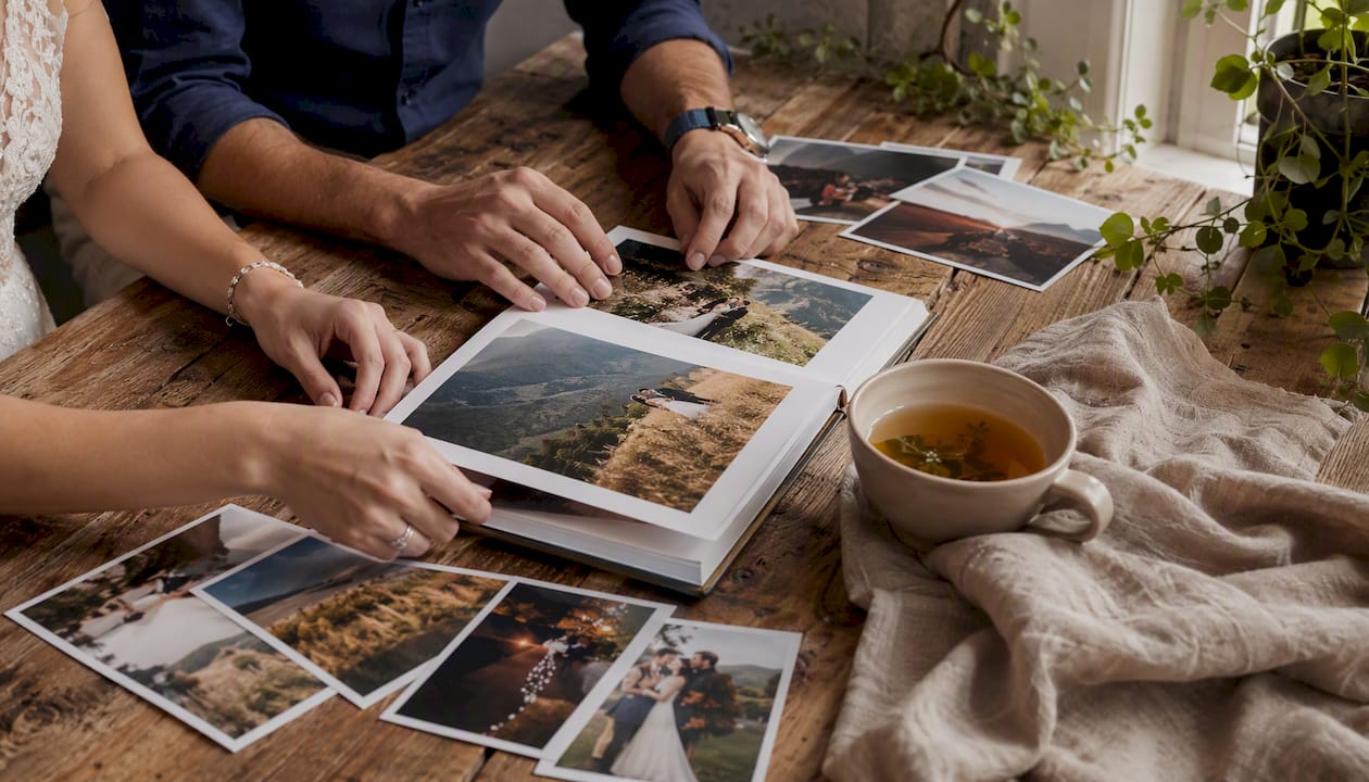
The most effective approach groups images by lighting chapter: prep, ceremony, portraits, reception. This isn't just organizational tidiness. It lets the viewer's eye adapt to each environment before moving to the next, reducing the jarring effect of jumping between radically different lighting conditions.
Within each chapter, pacing matters. A sequence that runs wide establishing shot, medium moment, close emotional detail creates a natural rhythm. It mirrors how we experience real events, zooming in on what matters. Without that variation, even technically perfect images feel flat.
- Open with an anchor image that establishes the chapter's mood and tonal key.
- Vary focal length and distance within the chapter: wide, medium, close, in that rough rhythm.
- Use recurring visual motifs (florals, venue details, a color palette echo) as connective tissue between chapters.
- Build toward emotional peaks rather than distributing them evenly. The ceremony's key moment should feel earned.
- Close with emotional resolution: a quiet, intimate image that lets the viewer exhale.
A good wedding photo album depends entirely on this sequencing logic. When the gallery flows, album design becomes intuitive. When it doesn't, no amount of beautiful spreads can compensate for images that fight each other.
How does your wedding-day timeline affect gallery consistency?
This is the part couples and planners have the most direct control over. Rushed schedules increase inconsistency and force heavy post-processing to correct exposures and color shifts that didn't need to happen. Protecting light windows isn't a photographer's preference. It's a technical requirement for consistent output.
Non-negotiable time blocks to protect:
- First look: 20–30 minutes in consistent, open shade or soft directional light before the ceremony. This is often the only time the couple is calm and the light is controllable.
- Portrait session: 45–60 minutes minimum, ideally timed to the hour before sunset. Golden-hour light is forgiving, flattering, and produces images that sequence naturally with ceremony shots.
- Couple sunset shots: Even 10–15 minutes at golden hour can anchor the reception chapter with images that feel tonally cohesive with the portrait session.
Logistics that support visual continuity:
- Build 10–15 minute buffers between key events. A photographer rushing from ceremony to family formals to portraits has no time to adjust settings or scout light.
- Designate a quiet prep area with consistent, natural light for detail shots. Rings, florals, and invitation suites shot under mixed artificial light look disconnected from the rest of the gallery.
- Share the venue layout with your photographer in advance so they can identify the best light positions for each chapter.
The visual narrative you want from your gallery is built on the timeline you protect. A 15-minute portrait session produces 15 minutes of usable light. That's not a creative problem. It's a physics problem.
What editing workflow actually produces consistent galleries?
A consistent editing workflow has four stages, and skipping any of them shows in the final gallery.
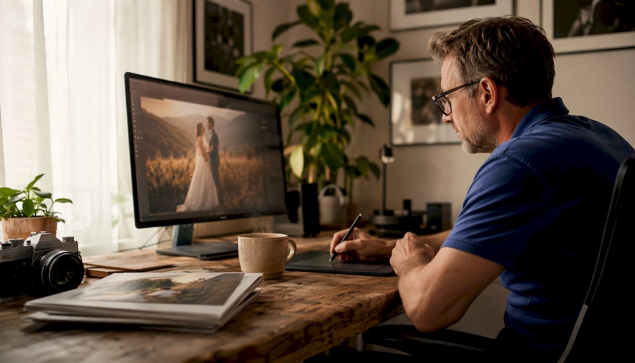
- Group by lighting chapter before touching a single image. Prep, ceremony, portraits, reception. Each group gets its own anchor image and its own preset variation.
- Pick anchor images from each group: the best-exposed, most representative frame. Edit that image to your target look first.
- Batch-apply base corrections from the anchor image across the group, then refine per-image for skin tones, exposure outliers, and any frames shot in transitional light.
- Run a final QA pass: a skin-tone check, a contrast consistency check, and a gallery walkthrough to catch any images that feel tonally out of place.
| Approach | Speed | Reliability Across Lighting | Typical Fixes Required |
|---|---|---|---|
| Single preset, batch-applied | Fast | Low: breaks in mixed light | High: per-image skin tone and exposure corrections |
| Preset variations per chapter | Moderate | High: anchored to each environment | Low: minor per-image refinements |
| Fully bespoke, per-image edits | Slow | Highest: fully controlled | Minimal, but time-intensive |
The Institute of Photographers' framework and Zettel Photography's guidance both point to the same conclusion: preset variations per lighting chapter, anchored to a reference image, is the most reliable balance of speed and quality. One preset applied to an entire wedding day is a shortcut that produces exactly the kind of inconsistency couples notice.
Questions to ask your photographer about consistency
Most photographers won't volunteer their editing workflow in a first conversation. You have to ask. These six prompts work in a call, an email, or an in-person meeting.
- Can I see two or three complete full-day galleries from recent weddings, not just your portfolio highlights?
- How do you handle skin-tone consistency when the lighting shifts from ceremony to reception?
- Do you use preset variations per lighting environment, or a single preset across the whole day?
- What does your editing review process look like before delivery?
- Do you provide color-corrected, print-ready files, or will I need to adjust colors before ordering prints or an album?
- How many final images should I expect, and are all of them retouched to the same standard?
Red flags to watch for when reviewing a gallery:
- Inconsistent white balance between images in the same chapter (faces shift from warm to cool)
- Widely varying contrast styles within a single gallery
- Crop styles that change without apparent reason
- A portfolio that shows only golden-hour or outdoor images, with no indoor or reception coverage
How does consistency affect editing time and what you pay?
Consistent capture reduces editing time. That's not a minor efficiency. When raw files come in with stable exposures and white balance, batch corrections work as intended and the per-image fix rate drops sharply. When they don't, every image needs manual attention, and editing hours multiply.
A professional gallery typically contains between 400 and 800 images depending on coverage. A smaller, highly consistent gallery of 450 images is almost always more valuable than 800 images with noticeable tonal variation. More images is not a proxy for more value.
What this means for pricing:
- Base packages with standard batch edits are faster to produce and priced accordingly. They rely on consistent capture to work well.
- Premium packages that include extensive color-grading passes and retouching cost more because they account for the manual work that inconsistent capture requires.
- A photographer who charges a higher flat rate for a consistent, workflow-led delivery is often the more cost-effective choice over time, because the output requires less correction before printing or album design.
The trade-off is real: tighter delivery specs and a disciplined workflow cost more upfront. But they reduce the back-and-forth over color corrections, the reprints from mismatched files, and the disappointment of a gallery that looked great on screen and printed inconsistently.
How Larsonprophotography approaches consistent gallery delivery
At Larsonprophotography, the workflow starts before the wedding day. Todd scouts venue lighting in advance, identifying the best portrait locations and the likely light conditions for each chapter of the day. That pre-wedding prep shapes the capture strategy.
Todd's practical checklist:
- Pre-wedding: venue lighting scout, identify portrait locations, note indoor ambient light sources (tungsten, mixed, natural)
- Day-of capture: manual mode with locked settings per environment, histogram discipline for every chapter, anchor-image selection in-camera
- Editing: group-by-lighting organization, anchor-image edits first, two-tier preset system (base preset plus chapter-specific variations), skin-tone pass across all images
- Final QA: contrast consistency check, gallery walkthrough, print-ready color verification
A recent San Antonio wedding illustrates how this works in practice. The ceremony was held outdoors in open shade, the portraits at golden hour, and the reception under warm tungsten lighting indoors. Three distinct lighting environments. By using separate preset variations anchored to a reference image from each chapter, the final gallery moved between those environments without tonal whiplash. The skin tones stayed warm and natural throughout. The album designed itself.
The goal isn't a gallery where every image looks the same. It's a gallery where every image feels like it belongs to the same story. That's what couples remember, and that's what prints beautifully ten years from now.
Pro Tip: When you review a photographer's full-day gallery, look at the reception images specifically. That's where inconsistency shows up most. If the skin tones hold and the contrast feels steady under mixed artificial light, the photographer has a real workflow.
Key Takeaways
Consistent wedding galleries require intentional capture, disciplined editing, and a protected timeline, not just a good preset.
| Point | Details |
|---|---|
| Full-day galleries reveal the truth | Ask to see complete galleries, not highlights, to judge real consistency across all lighting conditions. |
| Timeline protection is non-negotiable | Portrait windows and golden-hour time directly determine whether consistent output is even possible. |
| Presets need anchoring | A single preset applied to a full wedding day breaks in mixed light; chapter-specific variations are the reliable approach. |
| Gallery size isn't quality | A focused gallery with consistent editing outperforms a larger, disjointed set. A professional gallery typically contains between 400 and 800 images depending on coverage. |
| Larsonprophotography's workflow | Todd's pre-wedding scout, anchor-image method, and two-tier preset system are built to deliver cohesive, story-driven galleries. |
A photographer's honest take on what consistency really costs
Consistency is intentional work. It doesn't happen because a photographer has good taste or expensive gear. It happens because they built a system, protected the time to use it, and made deliberate choices at every stage from the venue scout to the final QA pass.
Couples can play a bigger role than most realize. Protecting portrait time, sharing the venue layout in advance, and building buffer windows into the schedule aren't just courtesies to the photographer. They're the conditions that make consistent output possible. Perfect uniformity isn't the goal, and chasing it would flatten the emotional range that makes a wedding gallery worth looking at. What matters is that the images feel connected, that the story holds, and that the editing hand is recognizable from the first frame to the last. That's achievable. It just requires planning on both sides.
If you want to talk through your venue timeline and spot any consistency risks before the day, that conversation is worth having early.
Larsonprophotography: story-driven galleries built for couples in San Antonio
Couples who want a gallery that reads like a complete story, not a collection of highlights, are exactly who Larsonprophotography works with. The workflow described in this guide, from the pre-wedding lighting scout through the anchor-image editing system and final print-ready QA, is the standard approach for every wedding photography package.
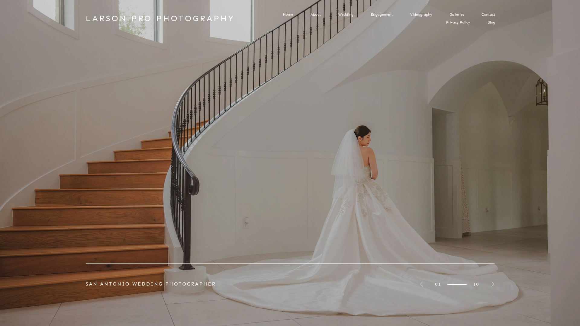
Full-day gallery examples are available on the clients page, where you can see how tonal consistency holds across ceremony, portraits, and reception chapters in real San Antonio weddings. If you're planning an engagement session as part of your pre-wedding photography, the engagement page shows how that same visual approach carries through to pre-wedding work.
To review your venue timeline and discuss how to structure the day for the most consistent output, reach out to book an initial consultation. The earlier that conversation happens, the more options you have.
Useful sources for further reading
| Source | What it covers |
|---|---|
| Institute of Photographers: Editing Framework | Tonal, color, and stylistic consistency; anchor-image methodology; gallery size guidance |
| Boxcar Photography: Planning and Consistency | How rushed timelines cause inconsistent output; the role of proactive planning |
| Zettel Photography: Building a Consistent Style | Preset variations per lighting condition; manual adjustment after batch processing |
| Lifewink Photography: Why Consistency Matters | Consistency as visual harmony vs. uniformity; curation and sequencing for narrative pacing |
| Masha Sakhno Photo: Full Gallery Evaluation | What to look for in a complete gallery; questions to ask when reviewing a photographer's work |