
Color grading in wedding photography is defined as the creative manipulation of color palettes, tones, and contrast to shape mood, emotional resonance, and visual style across an entire gallery. Unlike color correction, which fixes technical problems, grading is where artistic identity lives. The role of color grading in wedding photography goes far beyond aesthetics. It determines how couples feel when they relive their day, how cohesive a photographer's portfolio looks, and whether a gallery communicates warmth, romance, or timeless elegance. Tools like Adobe Lightroom Classic and DaVinci Resolve have made sophisticated grading accessible, but the craft behind the choices is what separates forgettable galleries from ones couples treasure for decades.
What is the difference between color correction and color grading in wedding photography?
Color correction and color grading are two distinct steps in the post-production workflow, and confusing them is one of the most common mistakes photographers make. Color correction fixes exposure and white balance, while grading creates mood and style. Correction comes first. Grading builds on top of it.
Color correction addresses technical failures: blown highlights from a harsh midday sun, green casts from fluorescent reception lighting, or underexposed ceremony shots in a dim church. The goal is accuracy. A corrected image looks neutral and true to life, but it does not yet look finished.
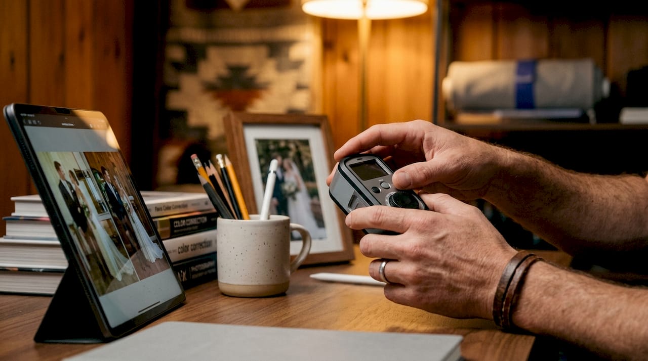
Color grading is where the creative decisions begin. You choose whether the ceremony portraits feel warm and golden or cool and airy. You decide if the reception shots carry deep shadows for drama or stay bright and clean. These choices define your visual signature as a photographer.
The key tools serve different purposes in this workflow:
- Adobe Lightroom Classic handles batch correction and grading for photo galleries, with presets and HSL sliders that make consistent looks scalable across hundreds of images.
- DaVinci Resolve is the industry standard for video color work, offering node-based grading and precise scopes for frame-by-frame control.
- LUTs (Look-Up Tables) translate a grading style into a reusable file, letting you apply the same mood to both photo and video exports.
Pro Tip: Never apply a stylistic grade to an uncorrected image. Skipping correction amplifies flaws rather than hiding them. A warm grade on an image with a bad white balance will look muddy, not romantic.
Clients and junior editors often misunderstand grading as a way to rescue poor shots. Professionals know grading is an enhancement, not a repair. That distinction shapes every decision in a healthy editing workflow.
How does color grading affect emotional impact in wedding photography?
Color grading acts as a psychological trigger. It shapes how viewers feel before they consciously process the narrative content of an image. Warm tones foster intimacy and nostalgia, which aligns directly with what couples want to feel when they look at their wedding photos.
The neuroscience behind this is well documented. Warm-toned color grades are rewatched 63% more often and score 34% higher on romantic emotional intensity than cool or high-contrast grades. That gap is significant. It means the grading choice you make in post-production directly affects how often a couple returns to their gallery or film.
"Color grading is not decoration. It is the emotional language of the image. Warm, soft grades tell the viewer: this moment was safe, joyful, and worth remembering. That message lands before a single face is recognized."
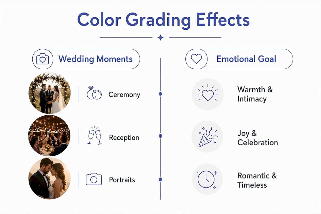
Different wedding moments call for different grading strategies. The table below shows how selective grading choices align with the emotional intent of each segment:
| Wedding Moment | Grading Approach | Emotional Goal |
|---|---|---|
| Ceremony | Warm, soft, lifted shadows | Reverence, intimacy, tenderness |
| Portraits | Golden tones, gentle contrast | Romance, timelessness |
| Reception | Brighter, higher energy | Joy, celebration, movement |
| Detail shots | Clean, neutral, accurate | Elegance, craftsmanship |
Avoiding over-stylized or extreme filters matters just as much as choosing the right grade. Hedonic adaptation causes viewers to tire quickly of intense, trendy filters. A gallery graded with a heavy orange-and-teal look may feel exciting in 2026 but dated by 2030. Natural, subtle grading ages well because it does not compete with the emotional content of the image.
The practical takeaway: match your grading intensity to the emotional weight of the moment. Quiet, intimate shots need quiet, intimate grades. High-energy reception frames can carry a bit more contrast and saturation without feeling forced.
Why does visual consistency matter, and how does color grading achieve it?
Visual consistency is the single most requested quality in professional wedding media. 82% of couples prioritize visual consistency between photography and videography when selecting vendors, up from 64% in 2022. Consistent color grading increases emotional impact by up to 30%. Those numbers reflect a real shift in client expectations.
Stat: 82% of couples in 2026 say visual consistency between photos and video is a top vendor selection factor.
Consistency does not mean every image looks identical. It means the mood, color temperature, and tonal range feel unified across the gallery. A couple should be able to flip through 400 wedding photos and watch their highlight film back-to-back without feeling like two different photographers shot the day.
Achieving this requires a deliberate approach:
- Establish a base preset before the wedding day. Apply it to all images as a starting point, then adjust for lighting conditions rather than starting from scratch on each shot.
- Match mood, not pixels. True color matching between video and photos is unattainable due to fundamental differences in dynamic range and sensor characteristics. Aim for mood alignment instead.
- Grade by scene, not by image. Group photos from the same lighting environment and grade them as a batch to prevent jarring tonal shifts between consecutive frames.
- Use the same LUT family across both photo exports and video grades to keep the color language consistent without requiring pixel-perfect matching.
Inconsistent grading reduces client trust and signals lower professionalism. A portfolio where some images are warm and golden while others are cool and desaturated tells prospective clients that the photographer lacks a defined style. Visual consistency is how a signature color palette becomes a brand asset. It is what makes a photographer's work instantly recognizable in a crowded market.
What are the most effective color grading techniques for wedding photographers?
The best color grading techniques for weddings in 2026 prioritize natural, organic results over heavily processed looks. Industry standards now favor subtle grading that enhances the original scene rather than replacing it. That shift reflects both client feedback and the neuroscience on viewer fatigue.
A reliable workflow follows this sequence:
- Correct first. Set accurate white balance, fix exposure, and neutralize color casts before touching any creative controls. This is non-negotiable.
- Apply a base grade. Use a preset or LUT that reflects your signature style as a starting point. This saves time and enforces consistency across the gallery.
- Refine with HSL sliders. HSL sliders, masking tools, and LUTs in Adobe Lightroom give you precise control over individual color ranges. Shift the hue of skin tones toward peach without affecting the greens in a garden backdrop.
- Use masking for selective adjustments. Brighten a bride's face without blowing out a bright window behind her. Deepen shadows in the background without crushing the subject's detail.
- Check consistency across the gallery. Review images in sequence, not in isolation. A single image may look great alone but feel jarring between two adjacent shots with different tonal ranges.
Popular grading styles for wedding photography
Three styles dominate professional wedding galleries right now. Warm and golden grades use lifted shadows, amber midtones, and soft highlights to create a timeless, romantic feel. Dark and moody grades pull shadows deep, reduce saturation, and add cool tones to the shadows for a cinematic, editorial look. Clean and airy grades push exposure slightly, desaturate greens and yellows, and keep skin tones neutral for a bright, modern feel.
Pro Tip: Shoot in RAW format on every wedding job. RAW files give you the full tonal range needed for grading. JPEG files clip highlights and shadows before you ever open the image, which limits how far you can push a grade without introducing artifacts.
The most common pitfall is applying a stylistic grade before completing correction. The second most common is choosing a grade based on what looks trendy rather than what serves the couple's story. A dark and moody grade applied to a bright outdoor summer ceremony fights the natural light rather than working with it. Let the scene guide the style, not the other way around.
Key Takeaways
Color grading is the creative layer that transforms technically correct wedding images into emotionally resonant, visually unified stories that couples return to for years.
| Point | Details |
|---|---|
| Correction precedes grading | Fix exposure and white balance before any creative grading to avoid amplifying technical flaws. |
| Warm grades drive engagement | Warm-toned grades score 34% higher on emotional intensity and are rewatched 63% more often. |
| Consistency builds trust | 82% of couples prioritize visual consistency; inconsistent grading signals lower professionalism. |
| Mood alignment over matching | Aim for unified mood across photos and video rather than pixel-perfect color matching. |
| Natural grades last longer | Subtle, organic grading reduces viewer fatigue and improves long-term gallery rewatchability. |
Why I think most photographers get color grading backwards
Most photographers treat color grading as the last thing they do, almost an afterthought after the real work of shooting and culling. That is the wrong frame entirely. The grade is the emotional argument you are making about the day. It should be a deliberate creative decision, not a default preset applied in bulk.
What I have seen consistently at Larsonprophotography is that the couples who come back for engagement sessions, who refer their friends, and who leave the most detailed reviews are the ones whose galleries feel unified. Not perfect. Unified. There is a difference. Perfect means technically flawless. Unified means every image feels like it belongs to the same story.
The mistake I see most often is chasing whatever grading style is trending on social media. Heavy desaturation, extreme color splits, orange-and-teal everything. Those looks get attention online, but they age badly. A couple looking at their wedding photos in 15 years should feel the warmth of that day, not the aesthetic preferences of a particular year. Natural, organic grades serve the memory. Trendy grades serve the algorithm.
The other thing worth saying plainly: grading cannot save a poorly shot image. I have watched photographers spend hours trying to grade their way out of bad exposure or wrong white balance. The professional workflow always starts with getting the shot right, then correcting it, then grading it. Skipping steps costs more time than it saves. Build the habit of shooting with your grade in mind, and the post-production work becomes faster and more consistent every time.
— Todd
Larsonprophotography's approach to color grading for wedding media
Larsonprophotography applies a structured color grading workflow to every wedding and engagement session, ensuring that photos and videos share a unified visual mood rather than looking like separate projects.
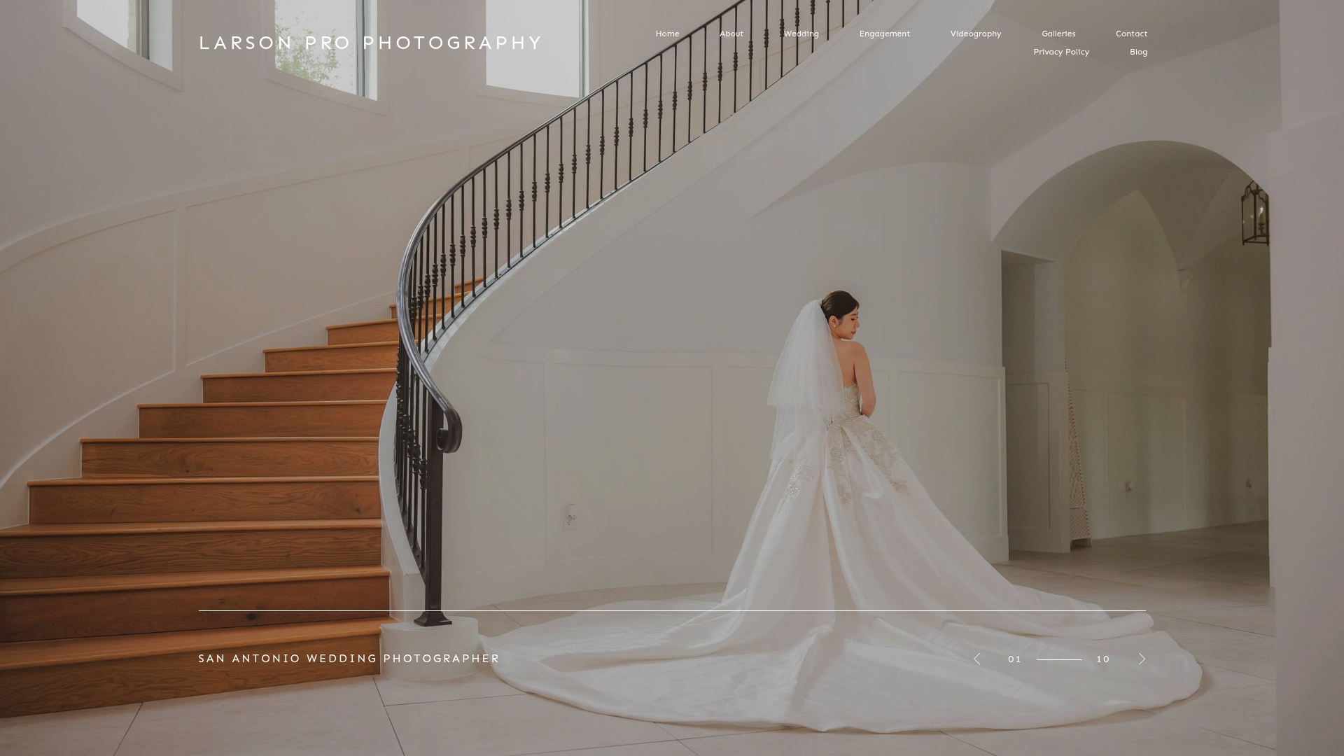
Every gallery delivered by Larsonprophotography goes through a two-stage process: full color correction first, followed by a signature grade that reflects the couple's chosen style and the natural light of their venue. The result is a cohesive wedding gallery where every image feels intentional. For couples planning ahead, the engagement session is also the ideal time to establish the grading style that will carry through to the wedding day, creating a visual thread from the first shoot to the final delivered gallery.
FAQ
What is color grading in wedding photography?
Color grading is the creative process of adjusting colors, tones, and contrast in post-production to shape the mood and visual style of wedding images. It is performed after color correction and defines the emotional character of the final gallery.
How does color grading differ from color correction?
Color correction fixes technical problems like exposure and white balance to make an image accurate. Color grading is the creative step that follows, shaping mood, warmth, and style to give the gallery its artistic identity.
Why do warm color grades work better for wedding photos?
Warm tones trigger feelings of intimacy and nostalgia, which align with the emotional content of wedding imagery. Research shows warm-toned grades score 34% higher on romantic emotional intensity and are rewatched 63% more often than cool or high-contrast grades.
How do photographers maintain visual consistency across photos and videos?
Photographers achieve consistency through mood alignment rather than exact color matching, since video and photo sensors capture color differently. Using a shared LUT family and grading by scene rather than by individual image keeps the overall look unified.
What grading styles are most popular for weddings in 2026?
The three dominant styles are warm and golden, dark and moody, and clean and airy. Industry standards in 2026 favor natural, subtle grading over hyper-edited or heavily filtered looks, as organic grades improve long-term client satisfaction and reduce viewer fatigue.